(CME Partner Content) – The fourth quarter of 2018 saw the most volatile equity market in recent memory. The S&P 500 index dropped from approximately 2900 to a low of around 2350 in December, a drawdown of almost 20% within the quarter. The implied volatility of S&P 500 peaked at over 30 following the same gauge hovering around 10 for long stretches during the preceding two years.2
With the rapidly moving market, trading volume in the equity market, including cash market, and, more significantly, in the futures market almost doubled the pace relative to the volatility trough.
During these episodes of volatility spikes, market observers have frequently commented on the “lack of liquidity” in the market. Commentators typically cite the fact that the depth of the “displayed order book” appeared to have been sharply curtailed during the quarter.
While the narrative of reduced displayed order book depth was true, one should wonder if it is painting the complete picture. After all, if trading volume virtually doubled during the period, was the market truly as illiquid as claimed? In this short article, an alternative data set is presented as a complementary measure of liquidity – one that measures the actual traded prices (i.e. the fill quality) in the market.
The limit order book is a repository for the currently unmatched orders. One would argue that “market makers” post two-sided orders in the order book and provide liquidity to the market. If “liquidity-taking” orders arrive at a high rate but are also followed by “liquidity-making” orders, the depth of the order book may be lower, but all the liquidity-taking orders could be served without the price moving. Indeed, the definition of a liquid market is that a large quantity of transaction takes place without impacting the prices much. If that is the case, it is hard to argue that the market is “illiquid” just because there are less idle orders in the book. The “fill quality” of the transactions should be considered before this illiquidity conclusion can be reached.
At the end of this article, the conclusion should be that liquidity in the E-mini S&P 500 index futures measured in fill quality have declined during the period but to a much milder and understandable extent than just looking at the order book in isolation would conclude.
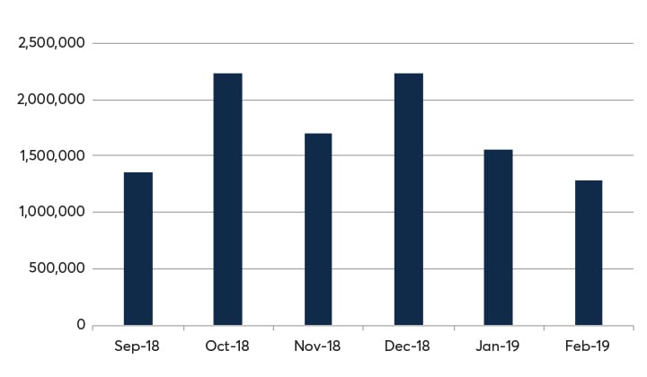
Before delving into this alternative set of data, some summary statistics will be presented to provide context for the ensuing discussion. Figure 1 shows the trading volume3 of E-mini S&P 500 index futures at CME Group. October and December 2018 were the two months with the most visible spikes in volatility and trading volume – virtually doubling the calmer and lower volume months.
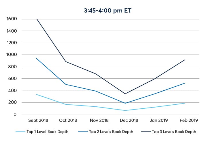
Figure 2 shows the average book depth by month from September 2018 through February 2019. The book depth at the top 1, 2 and 3 levels appeared to have dropped by approximately 75% from September to December, with a recovery thereafter.
Source: CME Group
The graphs are the cumulative limit order book quantity for E-mini S&P 500 index futures by month at the top three price levels. Average of the bid/ask quantities are sampled once per second for each of the four fifteen-minute intervals from the lead-month futures outright order book.
As a measure of fill quality, let’s look at the price range for transactions consummated in close temporal proximity of each other. In a liquid market, the range would be narrow; whereas the range would be wide in an illiquid market. Since E-mini S&P 500 index futures are traded virtually continuously, especially during the US day time trading hours, one could group all the trades consummating within the same second and find out the trading range within each one-second interval. Since the prices only move in fixed increments of trading ticks, the number of prices traded within that one second interval signifies the trading range.
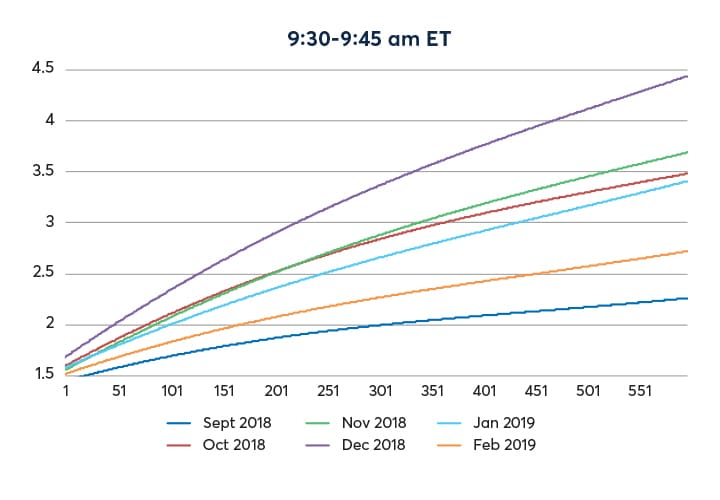
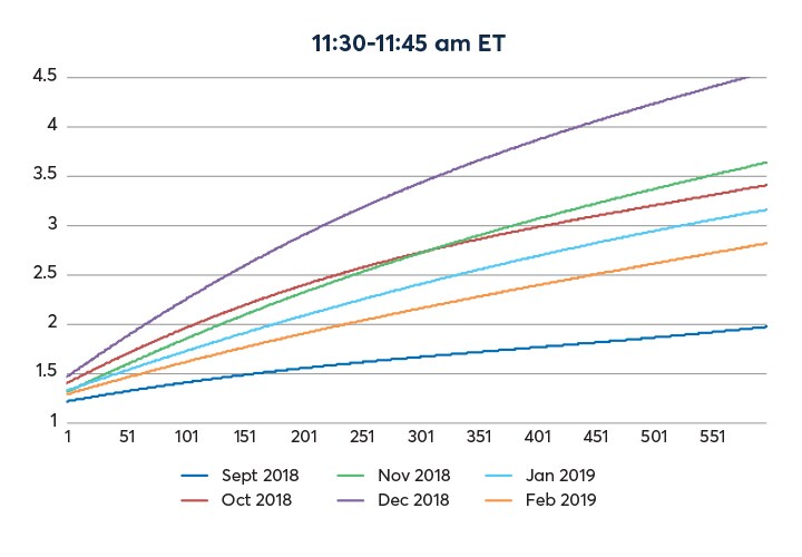
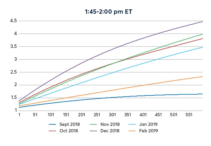
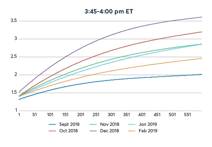
Figure 3 provides a comparison of price dispersion in relation to the rate of trading from September 2018 through February 2019. By way of example, if all the trades within the one-second period have the same identical price, the number of prices would naturally be one. If trades bounce between the top bid and offers without exhausting either, the number of prices would be two. Thus, the lower bound for the measure would be 1. When the trading volume is light, this measure tends to average close to 1.
This is what is illustrated in figure 3. X-axis denotes the rate of trading, i.e. number of contracts traded per second, whilst the Y-axis denotes the level of price dispersion. At a low rate of trading, the price dispersion (i.e. the average number of traded prices) is close to 1. As the rate of trading ramps up, the top level of the order book gets taken out and the price moves into the next level. Thus, the average number of prices will increase.
Source: CME Group
Y-axis denotes the average number of prices traded within a second, which serves as a proxy to the trading range. X-axis denotes the trading volume per second. For example, in February 2019 during the 15-minute windows each day of 9:30am-9:45am ET (yellow line in top left panel), a trading rate of 100 contracts per second would average number of traded prices of approximately 1.4. Each line denotes the estimated average price range within a second for each month during the time frame indicated in the heading of each chart. A wider dispersion of prices, after controlling for trading volume, indicates a less liquid market.
In a low volatility environment, like the E-mini S&P 500 futures market in September 2018, the increase in trading rate will be associated with a milder increase in the trading range. In a more volatile market environment, the same increase in trading rate will be associated with a more rapid increase in the trading range. This can be seen from the four panels in figure 3, and this in isolation could be taken as an indication that the market in December was less liquid than in September. However, this needs to be contextualized together with volume. The extent of the fill quality degradation is the interesting aspect to be examined.
Thus, a set of complementary graphs to show the trading volume pattern will be introduced below to put the comparison in proper context.
Source: CME Group
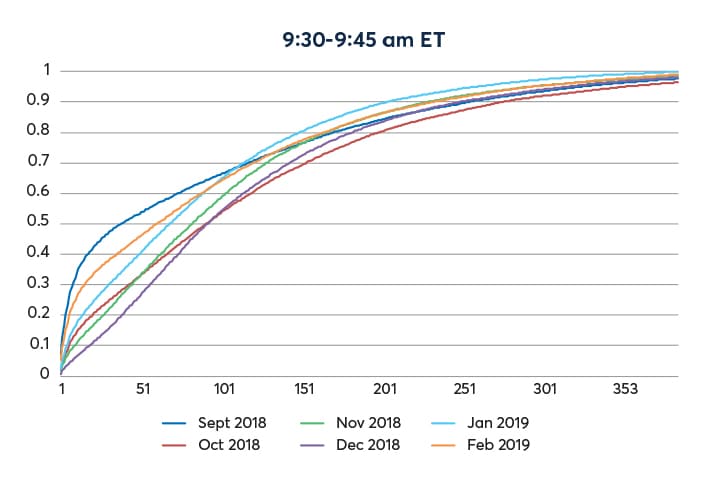
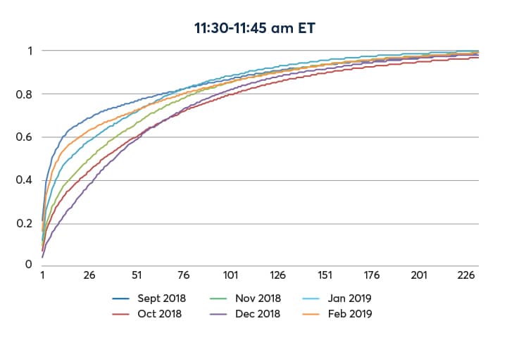
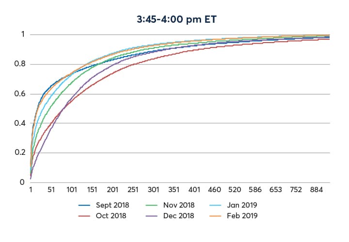
In each graph, the Y-axis represents the cumulative probability and X-axis represents trading volume per second. For example, during the 15-minute window each day of 9:30 – 9:45am ET in September 2018 (purple line, top left panel), trading at approximate 35 contracts per second or less has a cumulative probability of 0.50. In other words, the 50th percentile of trading volume per second is approximately 35. The same 50th percentile of per second trading rate is close to 90 for December. The cumulative density function for December lies to the right of that of September means the rate of trading in December was much higher than that of October.
Figure 4 shows the range of trading for September 2018 to February 2019. It is a well-known fact that trading concentrates a lot around the time of cash market open (9:30 am ET) and close (4:00pm ET). The rate of trading sags during the middle of the US trading day.
For example, in September, the 50th percentiles of trading rate were approximately 35 (contracts per second) around the cash market open and close, and 5 around the middle of the U.S. trading day. Certainly, trading happens in spurts, as illustrated by the very fat upper tail of this distribution.
Unmistakably, the rate of trading in December dwarfed that of September. The same 50th percentiles were almost twice those of September.
Armed with this set of graphs, one can conclude that 90% of the time (i.e. the 90th percentile), the trading rate was approximately at or below 300 contracts per second for the cash market open and close. The rate is at or below approximately 150 contracts per second around the middle of the trading day 90% of the time.
Going back to the figure 3 with the trading rate of 300 and 150 (i.e. the 90th percentile) for the market open/close and mid-day:
Cash market open/close – at 300 contracts per second, the average number of traded prices increases from approximately 2.0 (open, September) to 3.4 (open, December), and from 1.8 (close, September) to 3.2 (close, December). In other words, the price dispersion in December (the least liquid and the most volatile month) is at most 1.5 ticks wider than in September (the most liquid and least volatile month) 90% of the time.
Midday – at 150 contracts per second, the price dispersion increased from 1.5 (11:30am, September) to about 2.5 (11:30am, December), an increase of at most 1 tick, 90% of the time.
Traditional indicators of liquidity such as order book depth and price dispersion, if taken in isolation, point to the fact the market was less liquid in December 2018 than in September. However, for 90% of the time during the US trading day this increase of price dispersion was no more than approximately 1.5 ticks (or 0.375 index points… in relation to E-mini S&P 500 futures trading at prices in the range of 2350 – 2950 during this period, or approximately 1.5 basis point) while the market accommodated approximately twice the trading volume.
As pointed out in figure 1, the book depth appeared to have decreased by 75% in the same period while the trading volume doubled. While the fill quality degraded to some extent, it is also hard to argue that the market was “illiquid” in some absolute sense. There is more to liquidity measurement than just the average book depth.
The price dispersion charts are constructed in the following manner. For each second of trading, the volume traded in the lead month of the E-mini S&P 500 index futures as well as the range of traded prices, expressed in the form of number of traded prices, are recorded. These data points are sorted into the corresponding 15-minute windows. For a month with 20 trading days, there would be upwards of 18,000 such data points, noting that there could be a few seconds in which no trades were recorded.
Using the data points collected in the 15-minute windows, the curve representing the average price range in relation to the volume traded per second was estimated by applying kernel regression techniques. It is akin to finding the weighted “local” average (i.e. the average price dispersion at a given level of trading volume rate) without imposing too many assumptions on the underlying probability distributions of the data.
Similarly, the cumulated density functions are produced based on kernel density estimation methodology.
While the data on display in this article was from September 2018 – February 2019, additional analysis had been performed with the following conclusions: September 2018 (the most “liquid” month in the included dataset), was on par with other low volatility/high liquidity months, e.g. February 2017. The high volatility/low liquidity months of October and December 2018 within this dataset was on par with the data from February 2018 – the month that saw the demise of inverse volatility exchange traded products. The choice to show only six months of data in this article is made to keep the graphs tractable.
- See sections on rate of trading and magnitude of price dispersion for more details
- The implied volatility of S&P 500 also spiked in February 2018, coinciding with (or, perhaps, causing) the demise of the inverse volatility exchange traded vehicles. Following the spike, volatility subsided back to the low 10s prior to the fourth quarter.
- Note that “calendar spreads” trades, or rollover volume, are excluded from the data, as those are position management trades that were separate entering and exiting positions in E-mini S&P 500 futures per se, the inclusion of which would obscure the “illiquidity” picture.

